Creating the Crest of retail experience
By Satarupa Chakraborty | December 31, 2018
In the latest bid to remodel retail experience for consumers, part of its efforts to constantly innovate and adapt to suit changing consumer requirements, Louis Philippe has created a new retail ID.
 Louis Philippe, India’s leading premium menswear brand is prominently recognized by the brand logo – “The Crest” and the brand tagline – “The Upper Crest”. Synonymous with premium, international men’s fashion, Louis Philippe was brought to India by Aditya Birla Group in 1989, and ever since then, the brand has been focusing on precision in craftsmanship and creating clothing that is classic and contemporary. In the latest bid to remodel retail experience for consumers, part of its efforts to constantly innovate and adapt to suit changing consumer requirements, Louis Philippe has created a new retail ID. The unveiling of this ID at the Louis Philippe flagship store at Banjara hills, Hyderabad, which is spread over 4500 sq ft, in addition to numerous other stores across the country seems to have enhanced the brand image.
The face, the facade
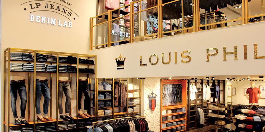
In an increasingly cluttered retail environment, Louis Philippe has consistently sought to improve the shopping experience for consumers and the new retail identity is all about offering better displays and simplifying the process of shopping. The store façade has been made larger and has adopted more gold elements with a warm light to create a premium imagery for the brand. The new retail ID also celebrates the “Crest” that has come to be recognized as a symbol of excellence and attention to detail.
 Display – stacked Vs open
With the advent of E Commerce, the expectations of consumers have drastically increased and it has become imperative to showcase more merchandise, thereby demanding the stores to accommodate a higher density of merchandise. Louis Philippe has decided to move closer to an open-display rather than a stacking method to enable this. Use of gold, brass and glass has replaced the use of wood in fixtures to impart a premium look and feel in the store.
 Functional yet fancy
To be highly relevant to consumers, Louis Philippe has adopted a design concept that uses zero props and focuses on merchandise. The brand has also moved from flush lighting to studio lighting and offers a cleaner, sharper and more focused look. Despite the push to be more functional, the brand has continued to add new elements to elevate brand imagery. For instance, the signature element of the library walls, which resonates with the learned and well- travelled men, has been an addition to the store that has reportedly been very well received. The introduction of white glass cladded walls and marble concierge with a mix of gold and wood also imparts elegance. The brand has also introduced some cutting edge technology to increase convenience, including the latest Omnichannel experience which allows consumers to book a look online prior to the arrival at the store and find their look at the trial rooms.

 Contribution of the new ID to the brand
Since the introduction of the new ID almost a year back, Louis Philippe has been able to standardize fixtures and lighting, resulting in a 25% reduction in rollout time and a savings of almost 20% of investment cost.
The retail design concept has three variants depending upon the market need – Platinum (flagship format), Gold (business format) and Silver (smaller markets). The ID has been taken to all three Louis Philippe store formats – House of Louis Philippe, Louis Philippe Sports and LP’s Shop-in-Shops. With 13 stores under the new design concept and close to 300 stores in the network, Louis Philippe is on track to bring 40% of their network under this ID by the end of 2019.
Design
Aditya Birla Funshion & Retail Ltd
Fixture
Elemental Fixtures and Sharma Interiors
Props
Shrishti Creation and DMSP


